
Overview
ID Label
ID Label Inc. is a leader in custom barcode labels and warehouse installation services, with an extensive range of products and solutions. Their existing digital presence struggled to communicate that depth clearly and consistently across channels.
Goal: Make ID Label’s products and services easier to understand and explore.
Outcome: Created a cohesive visual system across web, email, and social.
Project Type
Website & Marketing Design System
My Role
Lead Digital Designer
Software
Information Architecture & Strategy
Before moving into design, our team focused on restructuring the foundation of the site. ID Label Inc. offers over 100 products, and the existing experience lacked a clear organizational system. We collaborated with an SEO specialist to understand how users in the industry search—identifying key terms, behaviors, and expectations. Using these insights, we developed a new site map that re-categorized their offerings into a more intuitive structure, improving both discoverability and search visibility.
.png)

.png)
Design System & Visual Direction
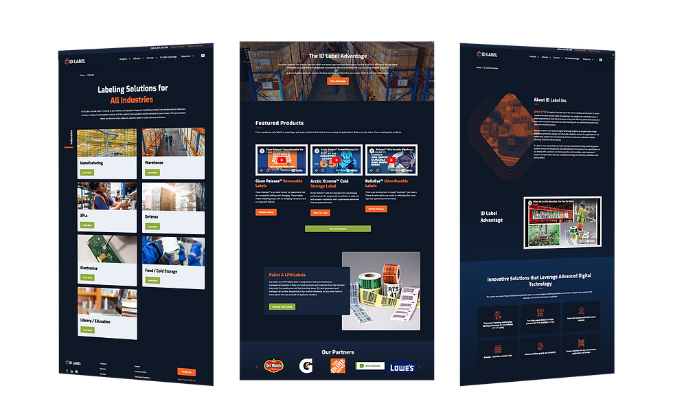
With a clear architecture in place, I developed a modern design system aligned to ID Label’s fast-paced operational environment. Updated typography, a refined color palette, and a stronger hierarchy improved clarity and usability. Inspired by the logo’s geometry, I introduced structured, directional elements that reflect flow and efficiency. A darker, elevated aesthetic—paired with gradient line work and duotone imagery—positions labeling as precise, modern, and innovative.

User Experience & Conversion
I paired the new visual system with an improved navigation framework, organizing the extensive product catalog into a clear and accessible experience. The goal was to help users quickly understand offerings and move efficiently toward solutions. A key focus of the redesign was strengthening primary conversion points, including “Request a Quote” and “Request a Sample.” These flows were restructured to make it easier for users to connect with ID Label Inc.’s team—positioning the site as both a marketing and sales tool while supporting product discovery and meaningful engagement.


Brand Extension & Launch
To carry the system beyond the website, I extended the visual language into a suite of HubSpot email templates. Since the platform was new to the client, I designed templates and lightweight style guidelines to create a clear, repeatable framework for campaigns. Content was designed in Canva to align with the client’s workflow, then translated into flexible, modular HubSpot layouts. Files were intentionally structured to be editor-friendly, making it easy for the client to update content while keeping the designs consistent.


